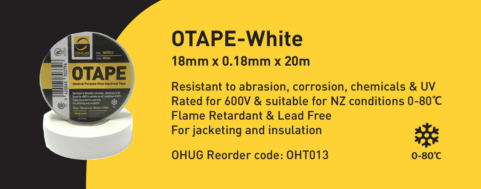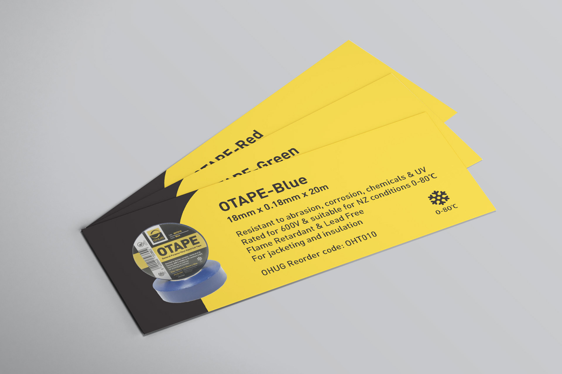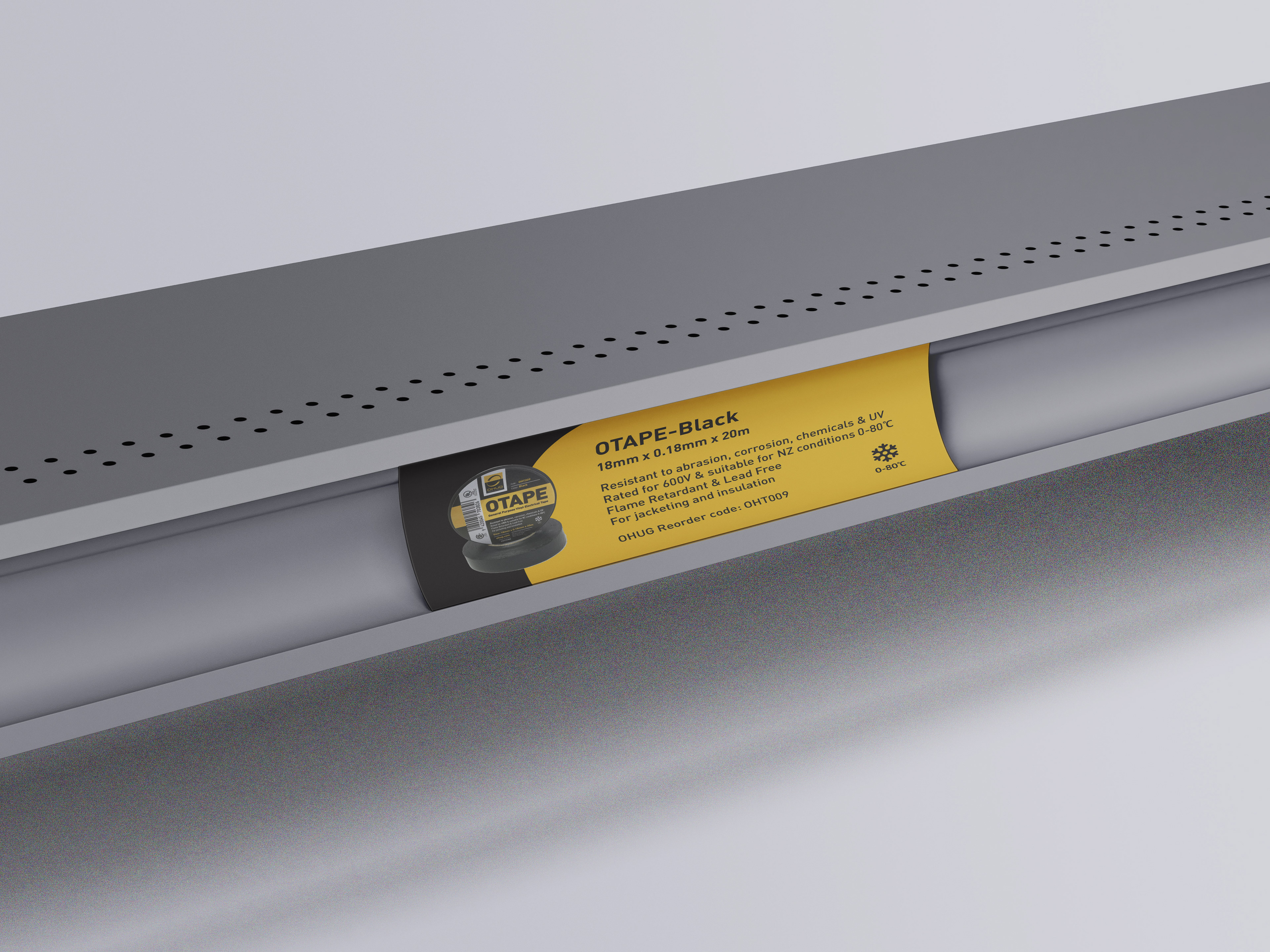
OTAPE Labels
Client: OHUG Power Equipment LTD
Asked to develop a label that stood out on the shelf from other labels that reflected the companies brand and image.
The approach I took with developing these labels was creating and modernising their preexisting labels by applying a curve that has been used as part of their branding. The use of yellow with the subtlety of black accentuates the label and creates shelf visibility.
Graphic Design, Packaging